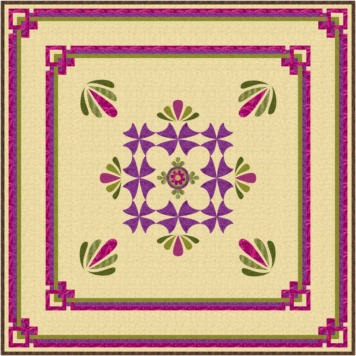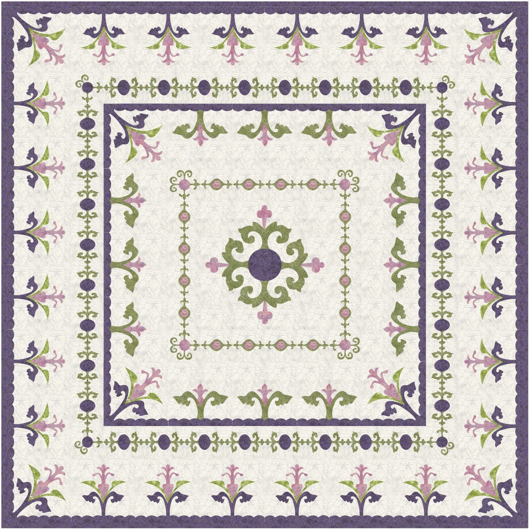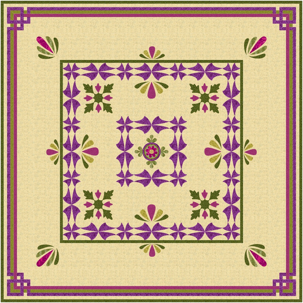
I love the strip borders with tangled corners, but would like to be able to redraft the applique borders to be more symmetrical, perhaps by removing the inner applique border around the centre block, or making it wider.

I love the second design … the applique is minimal, but well balanced, and there is a lot or room for some fairly simple quilting to shine. I would avoid too many busy feathers, but would use the fan shape used in the applique with a fair bit of background filling.
read more


